

The short answer: design your LinkedIn carousel slides at 1080 x 1350 px (4:5 portrait) for the most screen space on mobile, or 1080 x 1080 px (1:1 square) if you want the safest look across every device. Keep every slide the same size, then export the deck as a PDF and upload it as a document post. That is what a "carousel" on LinkedIn actually is.
If you only needed the number, you have it. Below is the full spec (with the parts LinkedIn actually publishes and the parts that are design opinion, clearly separated), plus a free tool that draws the exact frame and safe zone for you before you export.
Open the free LinkedIn Carousel Size tool: pick your aspect ratio (1:1, 4:5, or 16:9), and it renders the frame at the correct dimensions with a safe-zone overlay showing where to keep your text and logo so nothing gets cropped in the feed. No sign-up.
Key takeaways
- Best size is 1080 x 1350 px (4:5 portrait). It claims the most vertical space on mobile, where most of LinkedIn scrolls.
- Square (1080 x 1080 px, 1:1) also works and is the safest look across desktop and mobile. Keep every slide the same ratio.
- A "carousel" is a document post. Export the deck as a single PDF and upload it with the document option. There is no dedicated carousel button.
- LinkedIn's document limits: up to 100 MB, 300 pages, and 1 million words (PDF, PPT, PPTX, DOC, DOCX).
- Leave a safe margin. Keep text and logos about 10% (roughly 100 px on a 1080 px slide) in from every edge, because slides render smaller in the feed than in your design tool.
- Paid Carousel Ads are different: 1080 x 1080 px, 1:1 only, JPG or PNG, up to 10 MB per card, 2 to 10 cards. Do not reuse ad specs for an organic post.
First, which "carousel" do you mean?
Three different things get called a LinkedIn carousel, and they have different sizes. Sort this out before you design a single slide.
1. The organic carousel, which is a document post
This is what most people want. There is no separate "carousel" button on LinkedIn. The only way to publish a swipeable, multi-slide post organically is to upload a document (start a post, choose the document option, and upload a PDF, PowerPoint, or Word file). LinkedIn renders the pages as swipeable slides. If you want the click-by-click walkthrough, see how to make a carousel on LinkedIn and how to post a PDF on LinkedIn. Everything in the "sizes" section below is about this format.
2. Carousel Ads, which are a separate paid format
These live in Campaign Manager and follow their own spec (covered further down). If you are not running ads, ignore them. The sizes are not the same, so do not use ad specs for an organic post.
3. The multi-image post, which is a tiled collage
You can attach several images to a normal post, but LinkedIn lays them out as a collage grid, not a swipeable carousel. If you want people to swipe through slides in order, you need the document method, not multiple images.
LinkedIn carousel size and specifications (organic document post)
Full spec table: organic post vs paid ad
Every number in one place. The "organic document post" column is the swipeable carousel most people mean; the "paid carousel ad" column is the separate Campaign Manager format. Where LinkedIn does not publish an exact figure, the cell says so rather than guessing.
| Spec | Organic document (carousel) post | Paid carousel ad |
|---|---|---|
| Recommended pixel size | 1080 x 1350 px (portrait) or 1080 x 1080 px (square) | 1080 x 1080 px |
| Aspect ratio | 4:5, 1:1, or 16:9 (portrait recommended) | 1:1 only |
| File format | PDF, PPT, PPTX, DOC, DOCX (PDF is cleanest) | JPG or PNG (non-animated) |
| Max file size | 100 MB (whole document) | 10 MB per card |
| Max slides / pages | 300 pages | 10 cards |
| Min / max count | No stated minimum, up to 300 pages | 2 to 10 cards |
| Orientation | Portrait, square, or landscape | Square only |
| Max word count | 1 million words | Not applicable |
| Headline per slide / card | Not applicable (text lives inside the slide) | Up to 45 characters |
| Feed render size | Larger than an ad card; see LinkedIn's current limit | 312 x 312 px |
Recommended slide dimensions
| Format | Dimensions | Aspect ratio | Best for |
|---|---|---|---|
| Portrait | 1080 x 1350 px | 4:5 | The default. Takes the most vertical space on mobile, where most people scroll. |
| Square | 1080 x 1080 px | 1:1 | The safe, versatile choice. Looks consistent on desktop and mobile. |
| Landscape | 1920 x 1080 px | 16:9 | Only if your content is genuinely wide (a timeline, a screenshot). It shrinks the most in the feed. |
My default is portrait (4:5). It claims more of the phone screen than square does, and on LinkedIn the phone screen is the whole game. Whatever you pick, keep the ratio identical on every slide. Mixed sizes are the fastest way to get an ugly, jumping deck.
File requirements (these are LinkedIn's published limits)
According to LinkedIn's own Help documentation for document uploads:
- Accepted file types: PDF, PPT, PPTX, DOC, DOCX. PDF gives the cleanest result.
- Max file size: 100 MB.
- Max pages (slides): 300.
- Max word count: 1 million words.
Those are the ceilings, not targets. You will hit a design wall long before you hit 300 slides.
Safe zone: design guidance, not a platform rule
LinkedIn does not publish an official "safe zone," so treat this as a rule of thumb, not a spec. Keep your text and logo roughly 10% in from every edge. On a 1080 px slide that is about 100 px of breathing room on each side. The reason matters: LinkedIn shows your slides smaller in the feed than they look in your design tool, and most people see them on a phone. For paid carousel cards, LinkedIn even scales the image down to just 312 x 312 px in the feed (per its ad specs). Organic document posts render larger, but the principle holds: design for a small first impression. Anything crammed near an edge or set in small type disappears at a glance.
Carousel Ads sizes (the paid format)
If you are actually running LinkedIn Carousel Ads in Campaign Manager, the spec is different and stricter. Per LinkedIn's advertising specifications:
- Card size: 1080 x 1080 px. Cards must be 1:1 square only. Portrait and landscape cards are not supported.
- File type: JPG or PNG (non-animated).
- Max file size: 10 MB per card.
- Number of cards: 2 to 10.
- Headline per card: up to 45 characters.
If you upload anything that is not exactly 1:1, LinkedIn will crop or reject it, which is another reason the safe zone matters.
Here is the whole thing on one page: the two canvases you will actually use, side by side, with the safe margin drawn in.
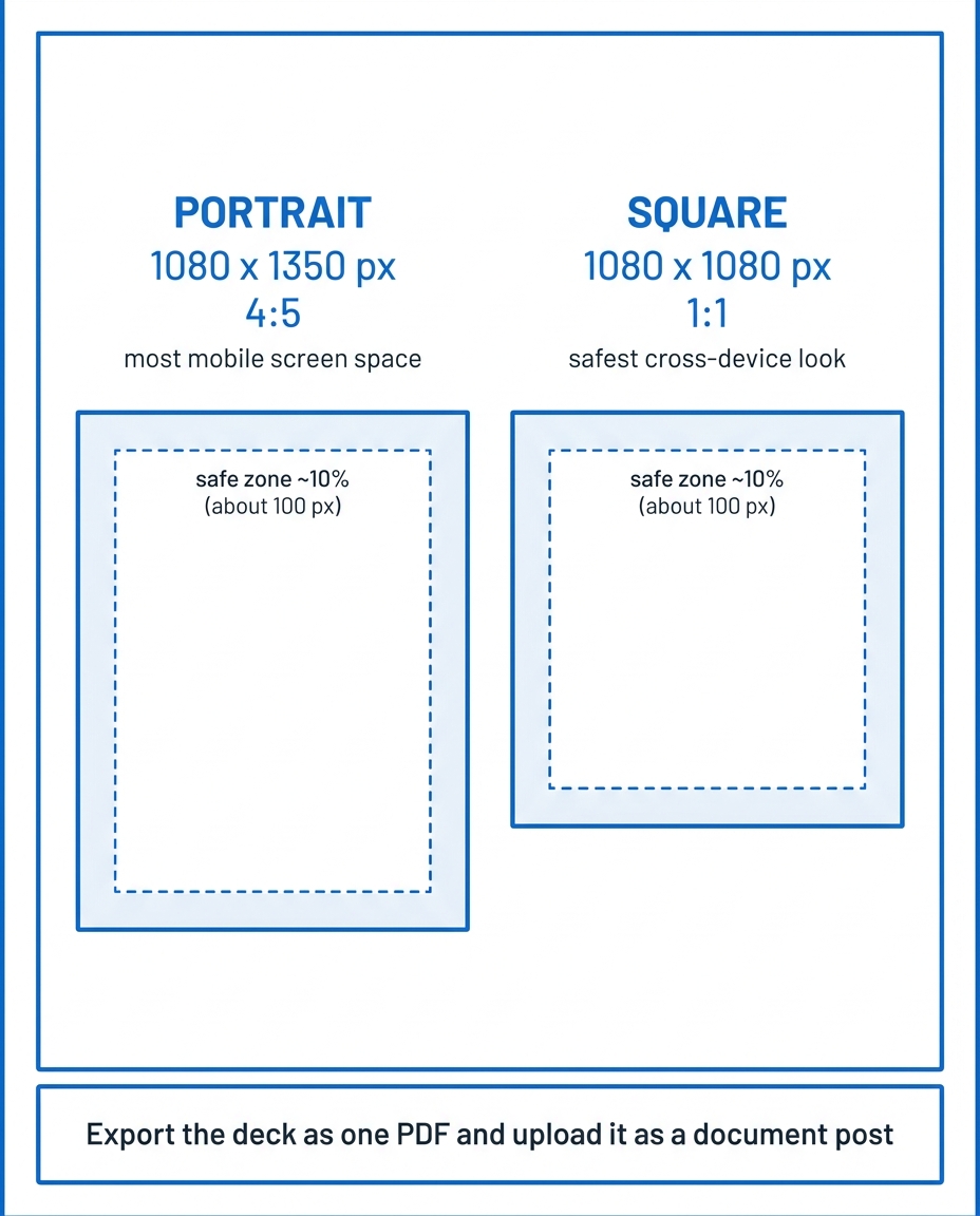
The two sizes worth using: 1080 x 1350 portrait and 1080 x 1080 square, both with a safe margin, both exported as a PDF.
Size is table stakes. Here is what actually earns the swipe.
Getting the dimensions right stops your carousel from looking broken. It does not make it good. A few opinions from building LinkedIn content for a living:
Design for saves, not likes. A carousel is a saveable asset. People bookmark a good one to come back to it, and saves are one of the strongest signals you are creating something worth keeping. So build the whole deck to be worth saving, and ask for it plainly on the last slide: "Save this for later." That single instruction outperforms a vague "follow me."
Write to an audience of one. Before you design, picture one specific person you are helping (a VP of finance evaluating a vendor, a solo consultant chasing her first five clients) and write every slide to them. "Content for everyone" reads as content for no one. A carousel aimed at one real reader feels sharp; a carousel aimed at "professionals" feels like filler.
The cover slide has one job: earn the swipe. Nobody reads slide 2 unless slide 1 stops them. Put your entire promise on the cover in the largest, plainest type on the deck. No logo-heavy title slide, no "Introduction." Lead with the payoff.
Carousels are worth the effort, but they are not your highest-ROI format. My working order for LinkedIn media is images first, then infographics, then carousels, then video. Reading dominates on LinkedIn and production effort climbs fast, so reserve carousels for genuinely saveable, structured content (a framework, a teardown, a step-by-step) where the swipe actually adds something. For the deeper build (structure, hooks, and slide flow), see the complete guide to carousel slides that convert. Do not turn a one-line thought into ten slides.
A few sizing-adjacent rules of thumb (my opinion, not platform rules): I aim for 6 to 12 slides, keep body text at roughly 24pt or larger and headlines 40pt or larger in my design tool, and use two to three lines of text per slide at most. White space is not wasted space on a carousel. It is what makes it readable at thumb speed.
Slide-design checklist (copy this before you export)
Guidelines, not platform rules. Run down the list on every deck:
- [ ] Same aspect ratio on every slide (pick 4:5 or 1:1 and lock it).
- [ ] Text and logo kept about 10% in from every edge (roughly 100 px on a 1080 px slide).
- [ ] Body text 24pt or larger, headlines 40pt or larger in your design tool.
- [ ] One idea per slide, two to three lines of text at most.
- [ ] First slide is the hook: the whole promise in the largest, plainest type.
- [ ] Strong contrast between text and background (dark on light, or light on dark).
- [ ] Last slide has one clear CTA ("Save this for later" beats "follow me").
- [ ] Exported as a single, flattened PDF so the text stays crisp on upload.
Writing the slide copy is usually the slow part. Once you have the raw material, LigoSocial's Content Atomizer can turn a long post or article into carousel-ready slides in your own voice, so you start from drafted copy instead of a blank deck. It handles the writing and atomizing, not the graphic design, so you still lay out and export the PDF in your design tool.
Common carousel size mistakes
- Mismatched slide sizes. One 4:5 slide in a deck of squares makes the whole carousel jump. Lock the dimensions before you design.
- Text and logos jammed against the edge. They get clipped or shrink into nothing in the feed. Respect the safe zone.
- Using landscape for a mobile audience. 16:9 gets letterboxed and feels tiny on a phone. Default to portrait or square.
- Exporting a heavy, unflattened PDF. Multi-layer PDFs can lose quality on upload. Flatten the PDF on export (most tools have a "flatten" option) to keep text crisp.
- Reusing ad specs for an organic post, or the reverse. 1:1 is mandatory for Carousel Ads; for organic document posts, portrait usually wins.
Before you export, run the deck's dimensions through the free carousel size tool and check your cover slide against the safe-zone overlay. It takes ten seconds and catches the cropping problems that only show up after you have already posted. Sizing other parts of your profile too? The LinkedIn banner size guide covers your header image and the slideshow feature.
Where LigoSocial fits
The size tool above is free and does one job well. The slower part is usually the words: the slides themselves, and the caption that sits above the carousel. That is where LigoSocial helps. Its Content Atomizer turns one long-form piece (a post, an article, a webinar transcript) into carousel-ready slides in your own voice, and LigoSocial Brain drafts the caption in that same voice, so you are editing instead of starting from a blank deck. If that caption still reads as a wall of text, format it the way LinkedIn actually renders line breaks before you post (here is why your posts are invisible). To be clear, LigoSocial does the writing and atomizing, not the graphic design, so you still lay out and export the PDF yourself. The free trial is 100 credits and needs no card.
FAQ
What size should a LinkedIn carousel be?
1080 x 1350 px (4:5 portrait) gives the most mobile screen space; 1080 x 1080 px (1:1 square) is the safest cross-device look. Keep every slide the same size and export the deck as a single PDF, then upload it with the document option.
What is the best aspect ratio for a LinkedIn carousel?
4:5 (portrait) for most feeds, because it fills more of a phone screen. 1:1 (square) is the versatile fallback. 16:9 (landscape) only suits genuinely wide content and shrinks the most in the feed. Whatever you choose, keep it identical on every slide so the deck does not jump.
How many slides can a LinkedIn carousel have?
LinkedIn allows up to 300 pages in a document post, so that is the hard ceiling. In practice I aim for 6 to 12 focused slides: enough to develop one idea, not so many that people stop swiping.
What format do you upload a LinkedIn carousel in?
Upload a document, not multiple images (several images become a tiled collage, not a swipeable carousel). LinkedIn accepts PDF, PPT, PPTX, DOC, and DOCX, up to 100 MB and 300 pages. PDF gives the cleanest result. Start a post, choose the document option, and upload the file; there is no dedicated carousel button.
Is portrait or square better for LinkedIn carousels?
Portrait (1080 x 1350) usually wins for organic posts because it claims more of the mobile screen, where most people scroll. Square (1080 x 1080) is the safer bet if you want a consistent look across desktop and mobile, and it is mandatory for paid Carousel Ads.
Are Carousel Ad sizes different from organic carousels?
Yes. Carousel Ads must be 1080 x 1080 px, 1:1 square only, JPG or PNG, up to 10 MB per card, with 2 to 10 cards. Organic document carousels are more flexible and usually look best in portrait.