
LinkedIn has no bold button. No italic button, no underline, no headings, no rich text editor of any kind for ordinary posts. Every styled LinkedIn post you have scrolled past was built by swapping normal letters for lookalike characters borrowed from the Unicode standard. This guide covers what that really means, which techniques earn their place, and the accessibility cost most formatting guides quietly skip.
Key takeaways
- LinkedIn's composer has no native formatting. Formatters substitute Unicode lookalike characters for regular letters.
- Unicode "bold" is not real bold. It is a different character, so it is not searchable on LinkedIn, it breaks hashtags, and screen readers often garble or skip it.
- Line breaks and white space are the highest-return formatting available, and they cost nothing in accessibility.
- The "see more" truncation point decides whether anything below it gets read. Format for that line first.
- Bold one line per post at most. Never bold a paragraph.
- Emoji used as bullet characters is the riskiest common habit, because a screen reader reads the full emoji name on every line.
LinkedIn has no bold button, so what are formatters actually doing?
Unicode is the character standard behind essentially all digital text. Alongside ordinary Latin letters it contains a block called Mathematical Alphanumeric Symbols: complete alternative alphabets in bold, italic, script, double-struck, and monospace. They exist so mathematicians can write formulas where a bold variable means something different from an italic one.
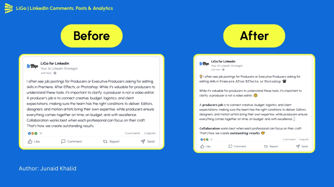
A LinkedIn text formatter swaps each character in your sentence for its lookalike from one of those blocks. The letter "a" in a bold-styled post is not the letter "a" wearing a bold style. It is a separate character named MATHEMATICAL SANS-SERIF BOLD SMALL A that happens to be drawn thicker. That distinction sounds pedantic. It is the source of every tradeoff in this article.
The workflow is always the same: paste your text into a formatter, pick a style, copy, paste into the composer. LigoSocial's free LinkedIn text formatter does it in the browser with no signup, and every other formatter works identically. Here is what the substitution produces:
- Plain: This line is not styled
- Bold: 𝗧𝗵𝗶𝘀 𝗹𝗶𝗻𝗲 𝗶𝘀 𝗯𝗼𝗹𝗱
- Italic: 𝘛𝘩𝘪𝘴 𝘭𝘪𝘯𝘦 𝘪𝘴 𝘪𝘵𝘢𝘭𝘪𝘤
Copy any of those into LinkedIn and they render exactly as they look here, because the styling is baked into the characters rather than applied by LinkedIn. That is also why the same trick works in your headline, your About section, and your comments.
The honest tradeoff: what Unicode formatting costs you
Most guides stop at "here is the tool, go make bold text." That is an incomplete answer, and the incompleteness has consequences for real readers.
Screen readers. Assistive technology maps characters to speech using each character's Unicode name, and Mathematical Alphanumeric Symbols do not reliably map to anything a screen reader wants to say. Depending on the reader and its settings, a styled line comes out as silence, as a stream of individual letters, or as a mouthful like "mathematical sans-serif bold small t, mathematical sans-serif bold small h." A styled paragraph can be effectively unreadable to a blind colleague. A single styled line is a minor annoyance. That gap is the entire argument for formatting sparingly.
Search. LinkedIn search matches the characters you actually typed. A post where "marketing" is styled as 𝗺𝗮𝗿𝗸𝗲𝘁𝗶𝗻𝗴 will not surface for someone searching "marketing", because those are not the letters in the query. If a keyword matters enough to bold, it matters enough to also appear in plain text in the same post.
Hashtags. A styled hashtag stops being a hashtag. LinkedIn only recognises the plain character set, so #𝗠𝗮𝗿𝗸𝗲𝘁𝗶𝗻𝗴 is decorative text that links nowhere.
Rendering. Not every device carries a font covering these blocks. On older Android builds and some corporate desktop images, missing glyphs render as empty boxes, and your styled hook becomes a row of rectangles.
Profile fields. Styling your name field is the one place to avoid entirely. It conflicts with LinkedIn's real-name expectations and makes you harder to find in search.
Formatting is not bad. It is a budget you spend, not a free upgrade. The psychology behind why styled posts pull attention is real, and so is the bill. Spend it on one or two moments per post.
Every LinkedIn formatting technique, mapped to its risk
This is the reference table, ordered from safest to riskiest rather than most to least popular.
| Technique | How to do it | When it helps | Accessibility or risk caveat |
|---|---|---|---|
| Line breaks | Press Enter twice between thoughts | Every post, without exception | None. The safest formatting that exists |
| Numbered lists | Type plain digits: 1. 2. 3. at line start | Steps, rankings, countdowns | None, as long as you use ordinary digits |
| Short paragraphs | Cap each block at one to three lines | Any post over roughly 400 characters | None |
| Bullet characters | Paste a real glyph such as • or a hyphen | Lists of three to five parallel items | Read aloud as the symbol name on every line |
| Unicode bold | Run the phrase through a formatter, paste | One key line or label per post | May be skipped or spelled out. Not searchable. Breaks hashtags |
| Unicode italic | Same process, italic style | A single term, source, or quiet aside | Same risks as bold, plus lower legibility at small sizes |
| Arrows and separators | Insert a character such as → between items | Compressing two ideas onto one line | Spoken as the character name. Never chain more than two |
| Emoji as bullets | Repeat one emoji at each list line start | Almost never | Full emoji name read aloud on every line. Reads as clutter |
| Decorative fonts (script, gothic) | Formatter, pick the novelty style | Never, for professional posts | Unreadable to assistive tech, often missing glyphs, looks like spam |
The pattern is simple. Structural formatting, the stuff that changes where words sit on the screen, is free. Character-substitution formatting, the stuff that changes what the words are made of, always has a bill attached.
Line breaks and white space do most of the work
If you change one thing after reading this, change your line breaks. Feed reading is fast and largely peripheral. A dense block signals effort before a reader has decided the post is worth any, so they scroll. White space signals the opposite.
Three rules cover almost every case:
- One idea per block. When the thought changes, press Enter twice.
- Cap blocks at three lines on mobile, roughly 100 to 150 characters.
- Put your single most important sentence alone on its own line, with blank space above and below.
That third rule is the one people miss. A sentence sitting alone is emphasised by position. It gets the attention bold would have bought you, it stays searchable, and a screen reader still reads it as words. It is strictly better than bolding, which is why well-formatted posts hold attention longer even when nothing in them is styled.
One warning: LinkedIn's mobile composer has historically been inconsistent about preserving consecutive line breaks. If your spacing collapses, draft in a plain text editor and paste the finished block in.
The "see more" cutoff decides whether the rest gets read
LinkedIn truncates posts in the feed and hides the remainder behind a "see more" link. Everything below that line is invisible until someone chooses to expand it, so the visible portion does all the work.
LinkedIn does not publish the exact cutoff and it has moved more than once. In practice it lands around the first two to three lines, roughly 140 to 210 characters, varying by device and feed layout. Treat any specific number you read as an estimate, including this one. Write the opening as if you have about 140 characters, then check the preview.
Three things belong above the cut:
- The hook. If you want first-line formulas that earn the click, that is a separate craft from formatting, and it matters more.
- A line break, so the visible portion ends mid-thought and creates the pull to expand.
- Nothing else. No hashtags, no links, no styled text competing with the sentence.
Three things do not: your call to action, your credentials, and any list. For the wider set of limits, including the 3,000 character ceiling on posts, see the LinkedIn post character limit guide.
Bullets, numbers and emoji: pick one list style and stop
Lists are the most over-formatted element on LinkedIn. Pick one style and stay consistent.
Numbered lists are the best default. Plain digits are ordinary characters, so they are searchable, they never break, and screen readers read them as numbers. Use them for anything sequential or ranked.
Bullet characters are the second choice. LinkedIn will not create a bullet for you, so you paste the glyph yourself. A plain hyphen at line start is safest of all, because assistive tech handles it gracefully. Keep lists to three to five items, since every item repeats the symbol announcement.
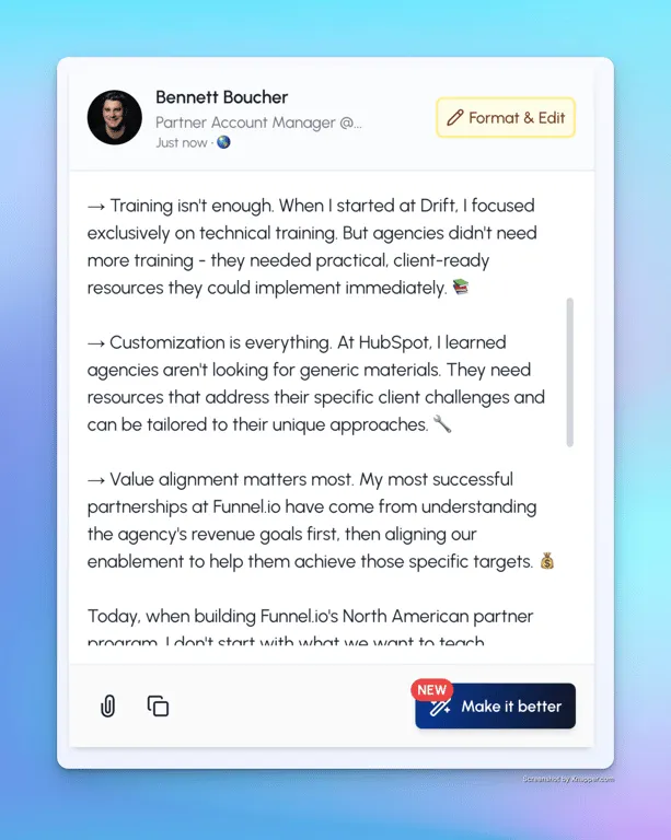
Emoji as bullets is the habit worth breaking. A checkmark at the start of eight consecutive lines means a screen reader announces "white heavy check mark" eight times before delivering any content. It is also the strongest visual signal that a post was assembled from a template rather than written.
Consistency matters more than the choice. Mixing bullets, numbers and emoji inside one post makes the structure harder to parse, because the reader has to work out whether different markers mean different things.
Bold and italic: the one-line rule
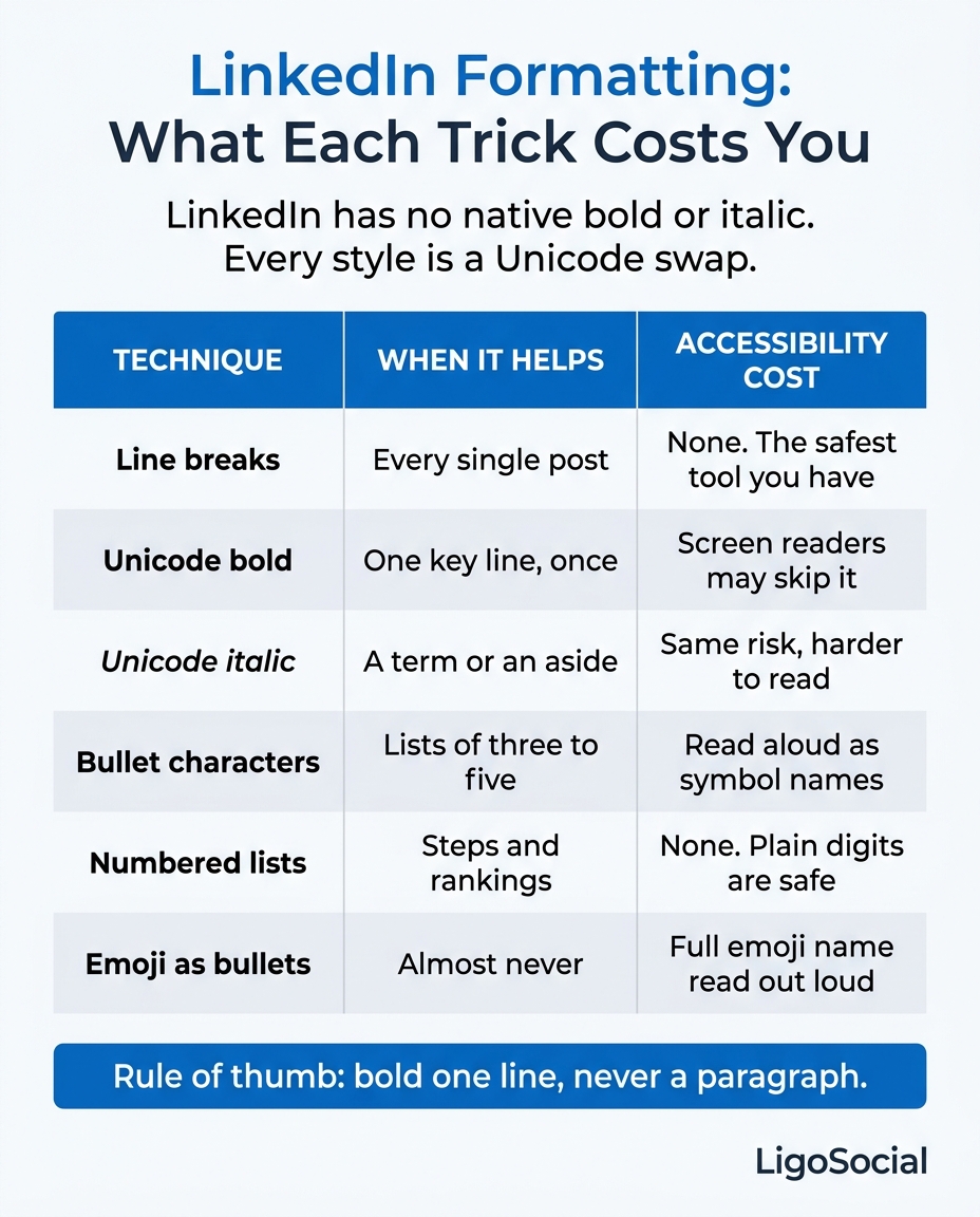
Here is the rule that keeps you on the right side of every tradeoff above: bold one line per post, and never a paragraph.
Bold works because it is scarce. The moment a second and third bolded phrase appear, none of them are emphasised any more, and you have made the post harder to read for everyone using assistive technology in exchange for nothing. If two things are equally important, neither is the thing to bold.
Good uses of a single bolded line:
- The one sentence carrying the argument, sitting alone in its own block.
- A short label at the head of a section in a long post, working as a heading.
- A number or result you want a skimmer to catch.
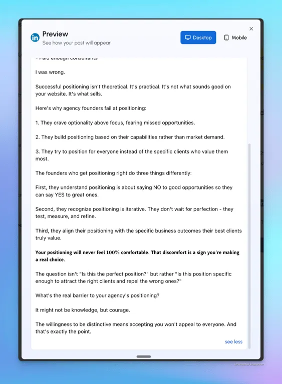
Italic has a narrower job: a single term you are introducing, a source attribution, or a short aside. Italic Unicode is harder to read at mobile sizes than bold, so a full italic sentence costs more legibility than it buys.
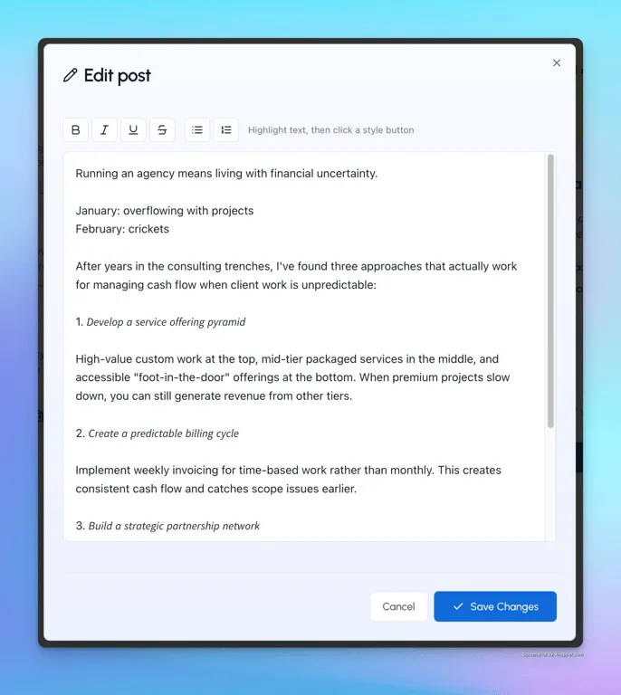
The pairing rule: if you bold a keyword, make sure it also appears unstyled somewhere in the post. That preserves search, keeps the meaning available to screen readers, and costs one extra mention. More on that failure mode in why formatted posts still end up invisible.
Here is the same decision compressed into one reference you can screenshot:
Three copyable post skeletons
Formatting is easier when you fill a shape rather than style from scratch. Square brackets are yours to replace, and the only styled element in each is the one bolded line.
Skeleton 1: the single-point post
[One sentence claim that sounds slightly wrong at first]

[One sentence of context, why you thought otherwise]

[Two or three sentences on the situation that changed your mind]

𝗕𝗼𝗹𝗱 𝗹𝗶𝗻𝗲: 𝘁𝗵𝗲 𝗹𝗲𝘀𝘀𝗼𝗻, 𝘀𝘁𝗮𝘁𝗲𝗱 𝗽𝗹𝗮𝗶𝗻𝗹𝘆

[One question inviting a specific answer, not "thoughts?"]
Skeleton 2: the numbered breakdown
[The outcome, in one line]

[One line on why the obvious approach fails]

1. [Step, six words or fewer]
[One line of detail]

2. [Step]
[One line of detail]

3. [Step]
[One line of detail]

[One line on what to do first]
Skeleton 3: the comparison
[A choice your reader is actually facing, framed as a question]

What most people do:
- [Behaviour]
- [Behaviour]

What actually works:
- [Behaviour]
- [Behaviour]

𝗧𝗵𝗲 𝗱𝗶𝗳𝗳𝗲𝗿𝗲𝗻𝗰𝗲 𝗶𝘀 [one phrase]

[One line inviting the counterexample]
Notice what is absent: no emoji bullets, no styled hashtags, no more than one bolded line, and the hook sits alone at the top where the truncation cut falls.
Where formatting sits in the rest of the job
Formatting is the last five percent of a post, and it only pays off if the other ninety five percent is in place. Most people invert the effort: twenty minutes styling a post nobody was going to see, zero minutes on distribution.
Growth on LinkedIn is roughly 80% strategic commenting and 20% original posting, so the highest-return half hour in your week usually happens in other people's comment sections rather than in a formatter. LiGo is built around that split: Engagement Lists save any LinkedIn search as a one-click curated feed so you are not hunting for people to reply to, and the comment co-pilot drafts six options (three in your voice, three optimized) inside the Chrome extension, where you pick and post one.
Before you publish, run this check. It takes under a minute.
- Read the first two lines alone. Do they work with everything else hidden?
- Count your bolded elements. More than one, cut back to one.
- Find each styled keyword. Does it also appear in plain text somewhere?
- Check your hashtags are unstyled.
- Preview on mobile. Look for collapsed line breaks and empty boxes.
- Read it aloud. If the separators make it awkward to say, they make it awkward to hear.
FAQ
Is it possible to format text on LinkedIn?
Yes, but not natively. The post composer has no bold, italic, or underline controls on desktop or in the mobile app. You format by running text through a Unicode formatter, which swaps regular letters for styled lookalike characters, then pasting the result in. Line breaks, paragraph spacing, and plain numbered lists are the exceptions: you can do those directly in LinkedIn, and they are the safest formatting available.
Does LinkedIn have a built-in formatter?
No. There is none for feed posts, comments, headlines, or the About section. LinkedIn Articles, the long-form publishing tool, do have a small rich text toolbar with real bold, italic, and headings, but that formatting only exists inside articles and cannot be carried into a normal post. For everything else, a third-party formatter doing Unicode substitution is the only route.
How do I bold text in a LinkedIn post?
Paste your sentence into a LinkedIn text formatter, choose the bold style, copy the output, and paste it where you want it. The styling travels with the characters, so nothing else is required. Bold one line at most, and make sure any bolded keyword also appears in plain text elsewhere so LinkedIn search can still match it.
How do I bold text in a LinkedIn post on mobile?
The same way, because the styling lives in the characters rather than in the app. Open a formatter in your phone's browser, generate the styled text, copy it, then paste it into the LinkedIn app. If your paragraph spacing collapses on paste, compose the whole post in a notes app first and paste it in as one block.
Does LinkedIn formatting hurt your reach or searchability?
Styled text carries no documented reach penalty, but it does carry two concrete costs. Unicode characters are not matched by LinkedIn search, so a styled keyword is invisible to anyone searching for it, and a styled hashtag stops working as a hashtag entirely. Heavy styling also makes a post harder for screen readers to interpret, narrowing your audience for no gain. Bold one line, keep keywords and hashtags plain, and neither cost applies to you.
Make the formatting the easy part
If you want the mechanics handled, the free LinkedIn text formatter is public and needs no signup. Paste, style one line, copy, post.
The harder half is sounding like yourself at volume, which is what LiGo Brain is for. It is the voice and memory layer, trained per client profile with no cross contamination, and it learns your tone, your topics, and the opinions you have already stated, improving every time you edit its output. That is the part formatting cannot fake: a styled line still has to be worth reading.
LinkedIn is a registered trademark of LinkedIn Corporation. LigoSocial is not affiliated with, endorsed by, or sponsored by LinkedIn.