
A well-formatted LinkedIn post is built in five parts: a hook that survives the mobile fold, a one-line promise, short body blocks separated by white space, one bolded phrase at most, and a closing question. LinkedIn hands you 3,000 characters and no bold button, so the format is the whole difference between a post people expand and a wall of text they scroll past. If you write on LinkedIn for pipeline and you have about ten minutes a day, this is the part that pays. Below is the anatomy, two copy-paste templates, and the fold rule most guides skip.
Key takeaways
- LinkedIn posts are plain text. There is no native bold or italic. The bold you see in other people's posts is Unicode characters pasted in from a text formatter.
- The character cap is 3,000, but the "see more" fold cuts at roughly 140 characters on mobile and 210 on desktop. Write your hook for 140.
- The best-performing posts usually run 1,200 to 1,600 characters with short blocks and double line breaks, not the full 3,000.
- Structure beats decoration. A hook, a re-hook promise, one idea taught well, and a closing question outperform any font trick.
- Use bold on one phrase at most, and never on a keyword you want found, because screen readers misread Unicode styling.
- The format is the wrapper. The words still have to sound like you, which is where most AI-written posts fall apart.
The anatomy of a well-formatted LinkedIn post
A high-performing post is not decorated, it is structured. Every zone has one job, and the formatting exists to serve that job, not to look busy. Here is the whole anatomy on one screen so you can copy the shape before you touch a single font tool.
| Zone | Where | Its one job | Formatting rule |
|---|---|---|---|
| Hook | Line 1 | Stop the scroll | Keep it under ~140 characters so it survives the mobile fold. Do not teach here. |
| Re-hook | Lines 2 to 3 | Promise the payoff | One short line, then a double line break to push "see more" down. |
| Body | The middle | Teach one thing | Blocks of 1 to 2 lines, a blank line between each. Bullets for steps. |
| Emphasis | Anywhere | Guide the eye | Unicode bold on one phrase, maximum. Never on a searchable keyword. |
| Close | Last 1 to 2 lines | Earn a comment | End on a question, not "DM me". |
If a post is underperforming, the fault is almost always in this table: a hook that teaches instead of hooks, no white space, three bolded sentences competing for attention, or a close that asks for a sale instead of a reply. Fix the structure first. Fonts are the last five percent.
Write for the fold, not the character limit
The single most important number in LinkedIn formatting is not 3,000. It is the fold. LinkedIn truncates your post behind a "...see more" link at roughly 140 characters on mobile and 210 on desktop, and most of your audience reads on a phone. You can write 2,800 thoughtful characters and only about 140 of them decide whether anyone reads the rest.
So your job in the first line is not to inform, it is to earn the click. A common move among strong creators is to write one sharp opening line, press Enter twice, and let the white space push the fold marker down, so the reader has already committed to the hook before the "see more" appears.
| Spec | Value in 2026 |
|---|---|
| Post character cap | 3,000 |
| Mobile "see more" fold | ~140 characters |
| Desktop "see more" fold | ~210 characters |
| Length that tends to perform | 1,200 to 1,600 characters |
| Native bold or italic | None (Unicode workaround) |
| Line break for real spacing | Press Enter twice |
For the full breakdown of every limit, from the post body to the headline and comments, see the LinkedIn character limit guide. And before you publish, run the post through a post preview to see exactly where your fold lands on mobile.
How LinkedIn formatting actually works
LinkedIn's composer accepts plain text only. No rich-text toolbar, no Markdown, no HTML. When people ask "how to format a LinkedIn post" with bold or italic, the honest answer is that LinkedIn does not support it natively, so you fake it with Unicode.
- Bold and italic: the "bold" text you see is Unicode mathematical alphanumeric characters, entirely separate characters that happen to look like bold Latin letters. You generate them in a formatter, then copy and paste them into the composer. Our free LinkedIn text formatter does exactly this. The deeper reason your normal typing looks flat is explained in the pillar guide, why your LinkedIn posts look invisible.
- Line breaks: press Enter twice for visible spacing. A single Enter does not always render a gap. Do not mix single and double breaks at random, it reads as broken.
- Bullet points: LinkedIn will not render a Markdown or HTML list, so paste a symbol at the start of each line yourself, followed by a space. Clean options are the round bullet, the arrow, or a checkmark. Keep each point on its own line.
- Emphasis, sparingly: the accessibility trade-off is real. Screen readers may read Unicode bold characters as individual symbols instead of words, so keep it to one phrase and never apply it to a term you want to be searchable.
The 2026 mistake is not under-formatting. It is over-formatting: three fonts, a bolded paragraph, and emoji standing in for words. Restraint reads as competence.
The post structure that earns the "see more" click
Formatting is how a post looks. Structure is why people finish it. After years of writing and dissecting LinkedIn posts, I keep coming back to two frameworks that do the heavy lifting, and they map cleanly onto the anatomy table above.
Trailer, Meat, Summary. Think of your first three lines as a movie trailer. Their only job is to earn the "see more" click, because that click is the event the algorithm watches. Most founders kill the post right here by trying to teach inside the trailer. Do not. The Meat teaches exactly one thing. The Summary is a Call to Conversation, a question that invites a reply, not a Call to Action that begs for a DM.
Hook, Re-hook, Value, CTA. The hook stops the scroll. The re-hook is the part almost everyone skips, and it is why readers bounce after line one: it makes a promise about what they will know by the end. Then the Value delivers on that promise, and the close turns attention into a comment or a follow. Miss any beat and you lose the reader at the exact point that beat was meant to hold them.
Before you write a word, pick your angle on purpose. Almost every post that breaks out is one of five archetypes: a personal story, a bold or contrarian opinion, a "here is how I solved X" tutorial, a before-and-after transformation, or a data-backed prediction. Choosing the archetype first forces the right hook, which is the antidote to the "every post sounds the same" problem. For a deeper library of shapes, see 7 LinkedIn post formats that increase engagement.
One more thing I learned the hard way: leave a small gap. On an opinionated topic, do not close every loop. A post that is a little incomplete invites readers to add their take in the comments, and comments are what lift reach.
Copy-paste LinkedIn post templates
Here are two structures you can paste into the composer and fill in. Both follow Trailer, Meat, Summary. The bracketed lines are yours. Where it says "(bold)", run that phrase through a formatter before posting.
Template 1: the contrarian opinion
[One-line claim most people in your field disagree with. Under 140 characters.]

Here is what changed my mind.  ← re-hook, then a blank line

[The common belief, stated fairly in one line.]

[The moment or data point that broke it for you.]

[What you do instead now, in 2 to 3 short blocks with a blank line between each.]

The (bold) one takeaway: [the single idea you want remembered].

[Closing question that invites the reader to disagree or add to it.]
Template 2: how I solved X
[The specific problem, framed as a result you got. Under 140 characters.]

The fix took [time], not [expected time].  ← re-hook, then a blank line

Before: [the painful starting point in one line].

What I tried that did not work:
• [failed attempt]
• [failed attempt]

What actually worked:
• [step one]
• [step two]
• [step three]

After: [the concrete outcome].

If you are stuck on the same thing, what have you already tried?
Notice what the templates do not have: no wall of text, no five fonts, no CTA screaming for a click. The structure carries the post. The formatting just keeps it readable.
Formatting is the wrapper, your voice is the payload
Here is the part every formatting tool quietly ignores: bold text does not make a post sound like you. A LinkedIn text formatter can style a sentence, but it cannot write the sentence, and a post that is perfectly formatted in a generic AI voice still gets scrolled past.
This is the job LigoSocial Brain does inside LigoSocial. It learns your tone, topics, and opinions from your past LinkedIn posts (connect your account or upload posts), then drafts each new post already shaped with a fold-friendly hook and white space, written in your own voice. Because training is per profile, a VA or an agency can draft and format on your behalf without the output drifting into that flat, everyone-sounds-the-same cadence. Formatting stops being a separate copy-paste chore and becomes part of the draft. If you want to see the shape land automatically, try the LinkedIn post generator.
The order that matters: pick the archetype, write in your voice, then format. Do it in reverse and you get a beautifully spaced post that says nothing.
Formatting mistakes that quietly kill your reach
Most reach problems trace back to a handful of formatting habits, not the algorithm.
- The wall of text. No line breaks means no white space, which means an instant scroll-past on mobile. Break every 1 to 2 lines.
- Teaching in the hook. The first three lines are the trailer. If they explain instead of intrigue, no one clicks "see more".
- Over-formatting. Multiple decorative fonts, a bolded paragraph, and emoji replacing words all read as noise. One emphasis, maximum.
- Bold on your keywords. Unicode styling breaks screen readers and can hurt discoverability. Keep searchable terms in plain text.
- A buried or begging close. A CTA that demands a DM performs worse than a genuine question. Ask something people want to answer.
Fix these five and the formatting takes care of itself. In my own posting over a recent 60-day stretch, tightening structure and leaning into comments tracked with a meaningful lift in profile views and inbound inquiries. Those are my own observed numbers, not a promise, but the direction is consistent: structure and conversation move the needle more than fonts do.
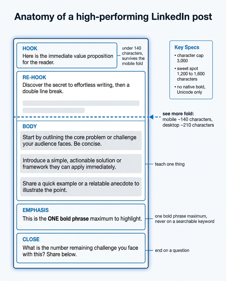
The five zones of a well-formatted LinkedIn post, and the fold line that decides how many people ever reach the rest.
FAQ
What is the best format for a LinkedIn post?
The best LinkedIn post format is a short hook under about 140 characters, a one-line re-hook that promises the payoff, a body of 1 to 2 line blocks separated by white space, one bolded phrase at most, and a closing question. Aim for 1,200 to 1,600 characters total. Structure matters more than fonts.
How do you format a LinkedIn post with bold or italic text?
LinkedIn has no native bold or italic, so you use Unicode characters. Write your post, run the phrase you want emphasized through a LinkedIn text formatter, then copy the styled output and paste it into the composer. Use it on one short phrase, not whole paragraphs, and keep it off any keyword you want to be searchable.
How do you bold text in a LinkedIn post on mobile?
The mobile app cannot bold text directly. Open a Unicode text formatter in your phone browser (or draft on desktop), apply bold there, copy the result, and paste it into the mobile post composer. The styled characters carry over because they are real Unicode characters, not app formatting.
What is the ideal LinkedIn post length in 2026?
The cap is 3,000 characters, but posts that perform tend to run 1,200 to 1,600 characters. Length is less important than the fold: the first 140 characters on mobile decide whether anyone expands the post, so front-load your best line.
What is the 5 3 2 rule on LinkedIn?
The 5-3-2 rule is a posting-mix guideline, not a formatting one. For every 10 posts, 5 share or build on other people's content, 3 are your own original posts, and 2 are personal and human. It shapes what you post over time, not how you format any single post.
Do line breaks help LinkedIn posts perform better?
Yes, indirectly. Line breaks create white space, which makes posts scannable on mobile and keeps readers moving down the post. Press Enter twice for a real gap, and use a break right after your hook to push the "see more" fold down so the reader commits to the hook first.
Format the post, then make it sound like you
If your posts read cleanly but still get scrolled past, the font is rarely the problem. Usually the format and the voice were bolted on after the writing, when they should have been built in from the first line. LigoSocial's LigoSocial Brain writes both together, in your voice, so the hook fits the fold and the post sounds like a person rather than a template. You can try it on your next post with 100 free credits, enough to test for about 7 to 14 days, no credit card. See current pricing at /pricing.
One question to sit with: open your last five posts on your phone and look at where the "see more" fold cuts. Which ones actually earn the click, and which ones die at line one?